- 前言
- 一、浮动
- 1.1.1、浮动的基本概念
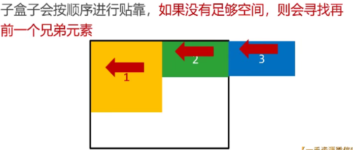
- 1.1.2、浮动的顺序贴靠特性
- 1.1.3、右浮动效果
- 1.1.4、案例:使用浮动设计网页布局(分析及源码)
- 1.1.5、BFC规范与浏览器差异
- 认识overflow属性
- 介绍overflow属性
- 介绍hiddle值
- 认识BFC原则(包含没有形成该原则案例)
- 解决盒子没有形成BFC情况(4种)
- BFC的其他作用(解决另外两个问题:①margin塌陷;②元素浮动覆盖)
- 浏览器差异
- 1.1.6、清除浮动
- 没有实现BFC规范带来的浮动问题
- 其他四种解决方案(非div设置height)
- 方式一:给每个父盒子都设置overflow: hidden
- 方式二:给后面的父盒子设置clear:both(margin不生效)
- 方法三:给每个父盒子添加::after伪元素,并设置clear:both
- 方式四:在两个盒子之间添加一个div元素并设置clear:both
- 二、定位
- 2.1、相对定位
- 介绍相对定位
- 案例1:简单展示相对定位
- 案例2:实际应用到导航栏微调(hover效果微调)
- 2.2、绝对定位
- 介绍绝对定位
- 案例1:绝对定位示例
- 案例2:绝对定位实现水平垂直居中
- 堆叠顺序index属性
- 案例3:轮播图实际案例(使用绝对定位)
- 2.3、固定定位
- 脱离文档流的三种方法
前言
本篇博客是关于CSS的浮动定位,若文章中出现相关问题,请指出!
所有博客文件目录索引:博客目录索引(持续更新)
一、浮动
1.1.1、浮动的基本概念
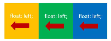
浮动功能:可以用来实现盒子的并排。
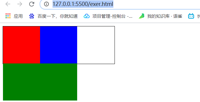
使用要点:①要浮动,并排的盒子都要设置浮动。②父盒子要有足够的宽度,否则子盒子就会掉下去。
示例:
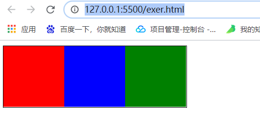
①完美贴合情况(子盒子的大小符合父元素)
<style>
    div.box1 {
        width: 300px;
        height: 100px;
        border: 1px solid #000;
    }

    .c1 {
        width: 100px;
        height: 100px;
        background-color: red;
        float: left;
    }

    .c2 {
        width: 100px;
        height: 100px;
        background-color: blue;
        float: left;
    }

    .c3 {
        width: 100px;
        height: 100px;
        background-color: green;
        float: left;
    }
</style>

<body>
    <div class="box1">
        <div class="c1"></div>
        <div class="c2"></div>
        <div class="c3"></div>
    </div>
</body>
②盒子掉下去情况
<style>
    div.box1 {
        width: 300px;
        height: 100px;
        border: 1px solid #000;
    }

    .c1 {
        width: 100px;
        height: 100px;
        background-color: red;
        float: left;
    }

    .c2 {
        width: 100px;
        height: 100px;
        background-color: blue;
        float: left;
    }

    /* 当设置宽度大于父盒子剩余内容宽度时就会被挤下去 */
    .c3 {
        width: 200px;
        height: 100px;
        background-color: green;
        float: left;
    }
</style>

<body>
    <div class="box1">
        <div class="c1"></div>
        <div class="c2"></div>
        <div class="c3"></div>
    </div>
</body>
1.1.2、浮动的顺序贴靠特性
浮动的元素一定要设置宽高:浮动的元素不再区分块元素、行内元素,已经脱离了标准的文档流,一律能够设置宽度与高度,即使它是span或a标签。
案例1:div元素贴合
<style>
    div.box1 {
        width: 300px;
        height: 200px;
        border: 1px solid #000;
    }

    /* 下面三个子盒子都设置左浮动 */
    .b1 {
        width: 200px;
        height: 200px;
        background-color: red;
        float: left;
    }

    .b2 {
        width: 100px;
        height: 150px;
        background-color: black;
        float: left;
    }

    .b3 {
        width: 100px;
        height: 50px;
        background-color: blue;
        float: left;
    }
</style>

<body>
    <div class="box1">
        <div class="b1"></div>
        <div class="b2"></div>
        <div class="b3"></div>
    </div>
</body>
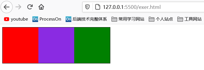
案例2:span元素进行贴合,使用浮动不再区分行内、块元素,并且能够设置宽高
<style>
    div {
        width: 300px;
        height: 100px;
        border: 1px solid #000;
    }

    /* span标签因为使用浮动元素(脱离文档流),可任意设置宽度高度 */
    .s1 {
        width: 100px;
        height: 100px;
        background-color: red;
        float: left;
    }

    .s2 {
        width: 100px;
        height: 100px;
        background-color: blueviolet;
        float: left;
    }

    .s3 {
        width: 100px;
        height: 100px;
        background-color: green;
        float: left;
    }
</style>

<body>
    <div>
        <span class="s1"></span>
        <span class="s2"></span>
        <span class="s3"></span>
    </div>
</body>
效果:
1.1.3、右浮动效果
实际与上面左浮动例子相同,只不过第一个设置有浮动的元素会先向右靠
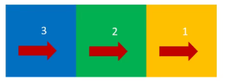
案例:
<style>
    div.box1 {
        width: 300px;
        height: 100px;
        border: 1px solid #000;
    }

    .c1 {
        width: 100px;
        height: 100px;
        background-color: red;
        float: right;
    }

    .c2 {
        width: 100px;
        height: 100px;
        background-color: blue;
        float: right;
    }

    .c3 {
        width: 100px;
        height: 100px;
        background-color: green;
        float: right;
    }
</style>

<body>
    <div class="box1">
        <div class="c1">1</div>
        <div class="c2">2</div>
        <div class="c3">3</div>
    </div>
</body>
效果:

1.1.4、案例:使用浮动设计网页布局(分析及源码)
效果展示与分析
首先将整个布局绘制出来,浮动的盒子在大盒子里,而不是直接将盒子置为浮动就向左靠或者右靠
效果图:
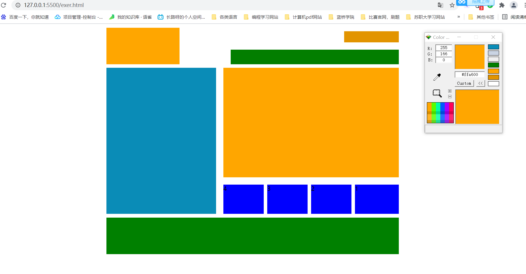
细节整理描述:
整体分为三个部分:上、中、下。
上:父盒子
- ①左边logo部分:使用左浮动。
- ②右边login部分(上):使用右浮动。
- ③右边nav部分(下):使用右浮动。凭借浮动顺序贴靠特性,只要设置宽度为>=①-②的宽度,即可会自动移到下面第二行,实现浮动布局。
中:父盒子
- 左边侧边栏:使用左浮动。
- 右边侧边栏:父盒子
- 右边(上):使用右浮动。
- 右边下:父盒子
- ul、li列表:使用右浮动
下:父盒子
重点:就是若是你想要使用浮动,一定要有一个父盒子,是基于这个父盒子进行浮动效果的,并且合理使用好顺序贴靠特性,达到网页布局的效果。
源码分析
源代码如下:
<!DOCTYPE html>
<html lang="en">

<head>
    <meta charset="UTF-8">
    <meta http-equiv="X-UA-Compatible" content="IE=edge">
    <meta name="viewport" content="width=device-width, initial-scale=1.0">
    <title>Document</title>
    <style>
        * {
            padding: 0;
            margin: 0;
        }

        /* 头部栏目 */
        header {
            width: 800px;
            height: 100px;
            /* background-color: black; */
            margin: 10px auto;
        }

        /* 中间部分 */
        section {
            width: 800px;
            height: 400px;
            /* background-color: orange; */
            margin: 10px auto;
        }

        /* 底部栏目 */
        footer {
            width: 800px;
            height: 100px;
            background-color: green;
            margin: 10px auto;
        }

        /* header之logo标志:左浮动 */
        header .logo {
            width: 200px;
            height: 100px;
            background-color: #ffa600;
            float: left;
        }

        /* header之login登陆模块:右浮动 */
        header .login {
            width: 150px;
            height: 30px;
            background-color: #e29400;
            float: right;
            margin: 10px 0 20px;
        }

        /* header之nav导航栏:右浮动(顺序贴靠特性向下) */
        nav {
            width: 460px;
            height: 40px;
            background-color: #027e00;
            float: right;
        }

        /* 中间区域之左边栏:设置左浮动 */
        section aside {
            width: 300px;
            height: 400px;
            background-color: #0a8cb7;
            float: left;
        }

        /* 中间区域之右边栏:设置右浮动(此时左右边栏就有间隔了) */
        section .main {
            width: 480px;
            height: 400px;
            /* background-color: #ffa600; */
            float: right;
        }

        /* 右边栏上半部分 */
        section .main .c1 {
            width: 480px;
            height: 300px;
            background-color: #ffa600;
        }

        /* 右边栏下半部分 */
        section .main .c2 {
            width: 480px;
            height: 80px;
            /* background-color: #ffa600; */
            margin-top: 20px;
        }

        /* 设置无序列表无样式 */
        section .main .c2 ul {
            list-style: none;
        }

        /* 使用列表来实现四个列表:进行左浮动 */
        section .main .c2 ul li {
            height: 80px;
            width: 110px;
            background-color: blue;
            margin-right: 10px;
            float: right;
        }

        /* 最后一个列表没有右边距,并且增大宽度10px */
        section .main .c2 ul li:first-child {
            width: 120px;
            margin-right: 0;
        }
    </style>
</head>

<body>
    <!-- 头部栏目 -->
    <header>
        <div class="logo"></div>
        <div class="login"></div>
        <nav></nav>
    </header>

    <!-- 中间区域 -->
    <section>
        <aside></aside>
        <div class="main">
            <div class="c1"></div>
            <div class="c2">
                <ul>
                    <li>1</li>
                    <li>2</li>
                    <li>3</li>
                    <li>4</li>
                </ul>
            </div>
        </div>
    </section>

    <!-- 底部区域 -->
    <footer></footer>
</body>

</html>
1.1.5、BFC规范与浏览器差异
认识overflow属性
介绍overflow属性
overflow 属性规定当内容溢出元素框时发生的事情。
属性描述:
| 值 | 描述 |
|---|---|
| visible | 默认值。内容不会被修剪,会呈现在元素框之外。 |
| hidden | 内容会被修剪,并且其余内容是不可见的。 |
| scroll | 内容会被修剪,但是浏览器会显示滚动条以便查看其余的内容。 |
| auto | 如果内容被修剪,则浏览器会显示滚动条以便查看其余的内容。 |
| inherit | 规定应该从父元素继承 overflow 属性的值。 |
实际案例:
<!DOCTYPE html>
<html>
	<head>
		<meta charset="utf-8">
		<title></title>
		<style type="text/css">
			div{
				width: 200px;
				height: 150px;
				border: #000000 solid 1px;
				overflow: scroll;
			}
		</style>
	</head>
	<body>
		<div>
			<img src="images/headimage.jpg" alt="">
			情歌》是陈没填词,伍冠谚谱曲,马来西亚歌手梁静茹演唱的一首情歌,收录在梁静茹第十张专辑《静茹&情歌—别再为他流泪》中,同时也是2009年中国台湾青春偶像剧《败犬女王》的插曲。 [1]
			2011年梁静茹发行的精选专辑《现在开始我爱你》中亦收录该歌曲。 [2]
		</div>
	</body>
</html>
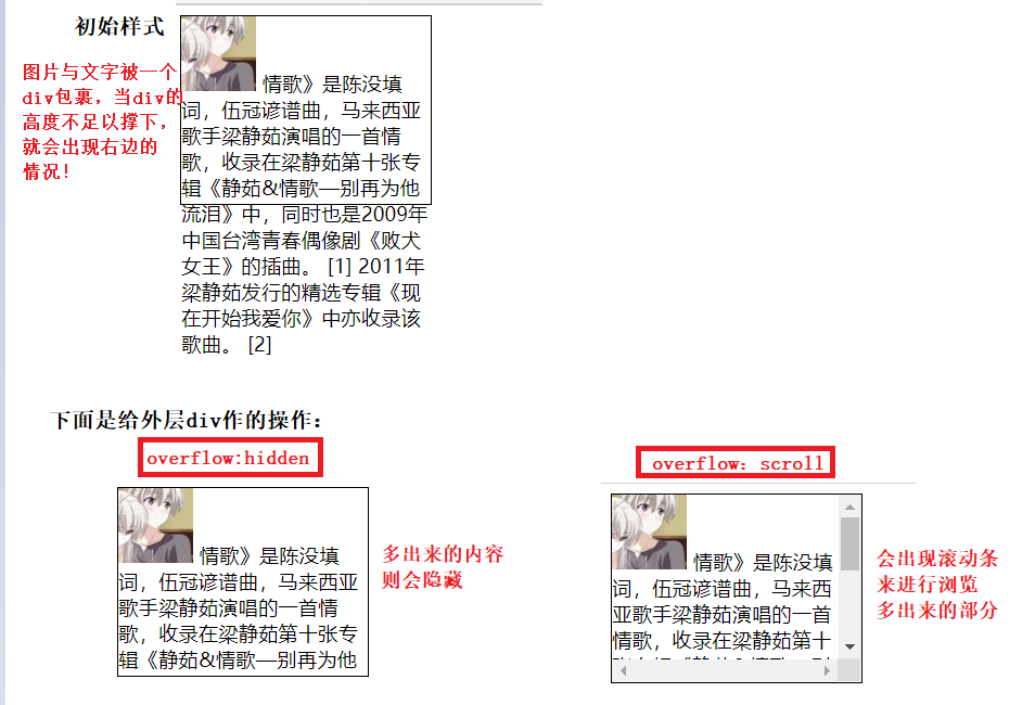
效果说明 :(两种样式分别为hidden以及scroll)
介绍hiddle值
溢出情况展示
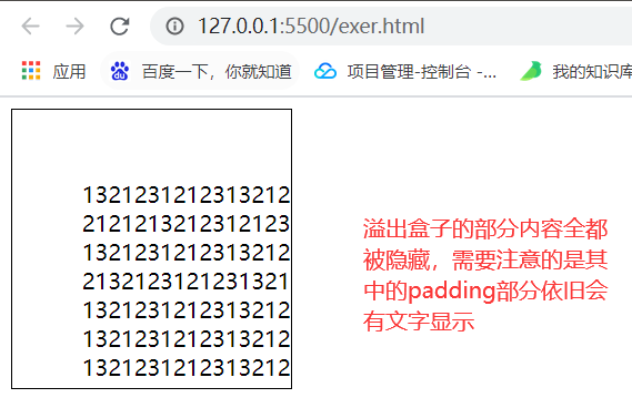
使用overflow: hiddle效果:溢出盒子边框的内容被隐藏,但是盒子的padding部分依旧会溢出。
举个例子吧:在一个div盒子中添加对应的文字,若是字数太多就会出现溢出的情况
<style>
    .box1 {
        width: 100px;
        height: 100px;
        padding: 50px;
        border: 1px solid #000;
        /* 添加溢出隐藏效果:溢出盒子边框的内容被隐藏,但是盒子的padding部分依旧会溢出 */
        /* overflow: hidden; */
    }
</style>

<body>
    <div class="box1">
        13212312123132121212132123121231321
        212121321231212313212121213212312123132121212
        132123121231321212121321231212313212121
        21321231212313212121213212312123132121212
        1321231212313212121213212312123132121212
        1321231212313212121213212312123132121212
        1321231212313212121213212312123132121212
        1321231212313212121213212312123132121212132
        12312123132121212
        132123121231321212121321231212313212121213212
        3121231321212121321231212313212121213212312123132121212
        132123121231321212121321231212313212121213212312123132121212
    </div>
</body>
出现溢出的情况:
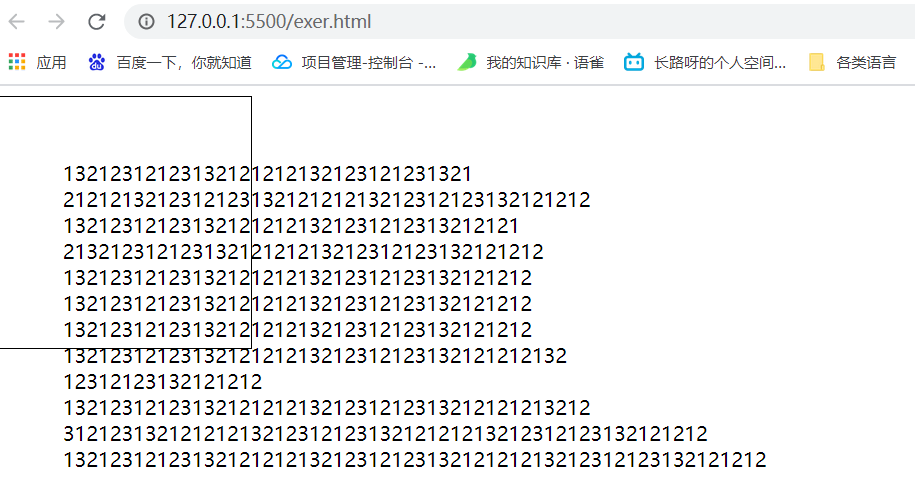
此时我们想让溢出边框的内容不显示怎么办?那么就可以使用到overflow: hiddle属性
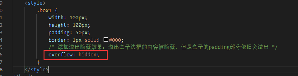
使用方式
添加overflow: hiddle,即可有溢出隐藏的效果
使用效果:作用范围是隐藏border之外的内容,padding区域不会被隐藏。(这里隐藏域display: none效果一致,对应隐藏位置内容都会不起作用)
认识BFC原则(包含没有形成该原则案例)
BFC(Box Formatting Context,块级格式化上下文):是页面上的一个隔离的独立容器,容器里面的子元素不会影响到外面的元素,反之亦然。
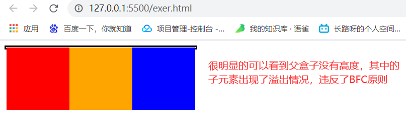
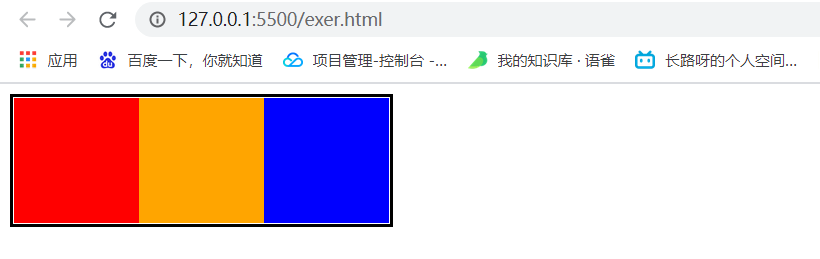
没有形成BFC原则的情况:多个浮动元素外的父盒子没有设置height高度属性时就可以说是没有形成BFC,案例如下:
<style>
    .box1 {
        /* 父盒子只设置了宽度,没有高度,实际上违反了BFC原则,可能会出现子元素影响外元素情况,本案例就出现了 */
        width: 300px;
        border: 3px solid #000;
    }

    /* 下面三个子元素都设置了左浮动,若是父盒子没有宽度就会出现溢出情况 */
    .c1 {
        height: 100px;
        width: 100px;
        background-color: red;
        float: left;
    }

    .c2 {
        height: 100px;
        width: 100px;
        background-color: orange;
        float: left;
    }

    .c3 {
        height: 100px;
        width: 100px;
        background-color: blue;
        float: left;
    }
</style>

<body>
    <div class="box1">
        <div class="c1"></div>
        <div class="c2"></div>
        <div class="c3"></div>
    </div>
</body>
如何解决该种情况出现的问题呢?有四种方法进行解决。
解决盒子没有形成BFC情况(4种)
问题来源:违反BFC原则,盒子没有设置height,就会导致内部使用浮动效果有问题。
解决四种方式:
- 设置float属性,不是none即可。
- 使用定位position属性,只要不是static或者relative即可。
- 使用显示属性:display的值是inline-block、flex或者inline-flex。
- 使用溢出清除:
overflow: hidden;
上面提到的四种方式只需要在父盒子的样式表中设置即可!
那么究竟哪种方法会更好一些呢?其中1、3方法不太靠谱,只有2、4方法比较靠谱。下面说明了不靠谱方法的原因。
- 方式一:父盒子上设置float: left。不靠谱:盒子不能平白无故的设置浮动,使用浮动来形成BFC不靠谱
- 方式三:父盒子上面设置display: inline-block:不靠谱:因为一个盒子本来就是一个块级元素,现在将其变为一个行内块就有点问题了,之后放上a标签就能够并排了。
靠谱的是第2、4方法:着重介绍
- 2方式:使用定位
postion: absolate。
4方式:使用overflow: hidden 方式
- 表示溢出、隐藏,溢出盒子边框的内容将会被隐藏,该方式是非常好用的让盒子形成BFC的方法。

效果展示:
BFC的其他作用(解决另外两个问题:①margin塌陷;②元素浮动覆盖)
前面解决的是没有构成BFC的问题即父盒子中的子元素都使用浮动时没有设置高度属性height就会出现子元素溢出的情况,之后我们给出了四种解决方案,最靠谱的两种是设置位置(position: absolate)以及使用溢出清除属性(overflow: hiddle)。
其实这几种解决方案还能够解决另外两个问题(建议使用溢出清除overflow: hidden属性):①取消盒子margin塌陷问题。②阻止元素被浮动元素覆盖的问题。
①取消盒子margin塌陷问题:就是之前学习到出现的margin塌陷问题(上下情况)
<style>
    * {
        margin: 0;
        padding: 0;
    }

    .p1 {
        width: 200px;
        height: 200px;
        border: 1px solid #000;
        background-color: red;
        /* 设置底部外边距为50px */
        margin-bottom: 50px;
    }

    .p2 {
        width: 200px;
        height: 200px;
        border: 1px solid #000;
        background-color: orange;
        /* 设置外边距上面为50px */
        margin-top: 50px;
    }
</style>

<body>
    <p class="p1"></p>
    <p class="p2"></p>
</body>
问题效果:
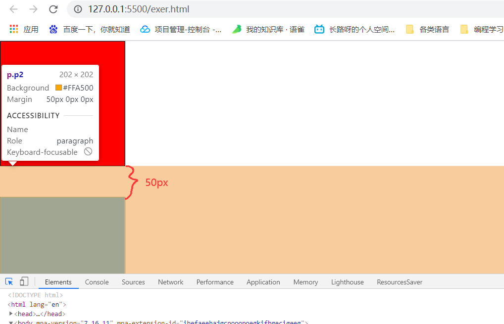
说明:两个盒子一个设置外边距下50px,另一个盒子设置外边距上50px,就会出现margin塌陷问题,取最大值作为外边距。
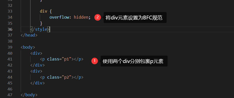
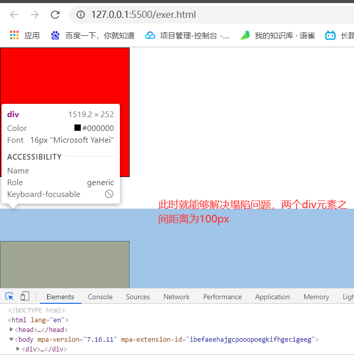
解决方案:使用两个div将p标签包裹起来,之后让div形成BFC规范
解决后效果:
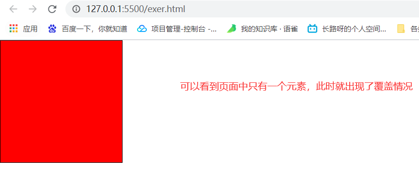
②元素浮动覆盖问题
问题描述:有两个盒子,一个设置了左浮动,另一个没有设置此时就会出现覆盖问题
代码示例:
<style>
    * {
        margin: 0;
        padding: 0;
    }

    .box1 {
        width: 200px;
        height: 200px;
        border: 1px solid #000;
        background-color: red;
        /* 第一个元素设置左浮动 */
        float: left;
    }

    /* 第二个盒子没有设置左浮动,就会默认覆盖在第一个左浮动的盒子中  */
    .box2 {
        width: 200px;
        height: 200px;
        border: 1px solid #000;
        background-color: orange;
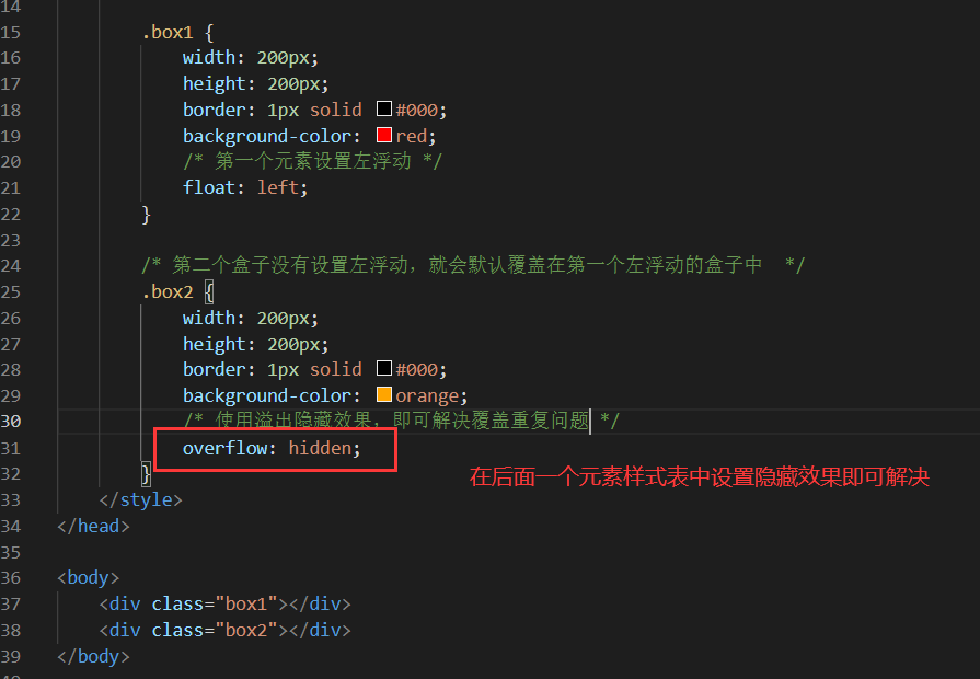
        /* overflow: hidden; */
    }
</style>

<body>
    <div class="box1"></div>
    <div class="box2"></div>
</body>
问题效果:
解决方案: 在后面一个没有设置左浮动的元素上添加overflow: hidden
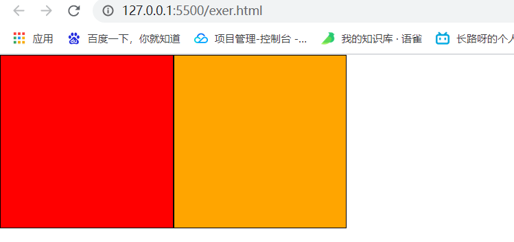
解决后效果:
浏览器差异
IE6、7浏览器使用haslayout机制与BFC规范略有差异,在IE浏览器上可以使用zoom:1的属性,就可以让盒子拥有layout。
- 其实本质都是与之前提到的相同。
注意点:如果要制作兼容到IE6、7的网页时,一定要让网页布局变得简单,内部有浮动的盒子要设置height属性!!!这样实际也就避免了出现不符合BFC规范了,对于使用overflow: hidden还可解决另外两个问题①margin塌陷。②元素浮动覆盖问题。
1.1.6、清除浮动
没有实现BFC规范带来的浮动问题
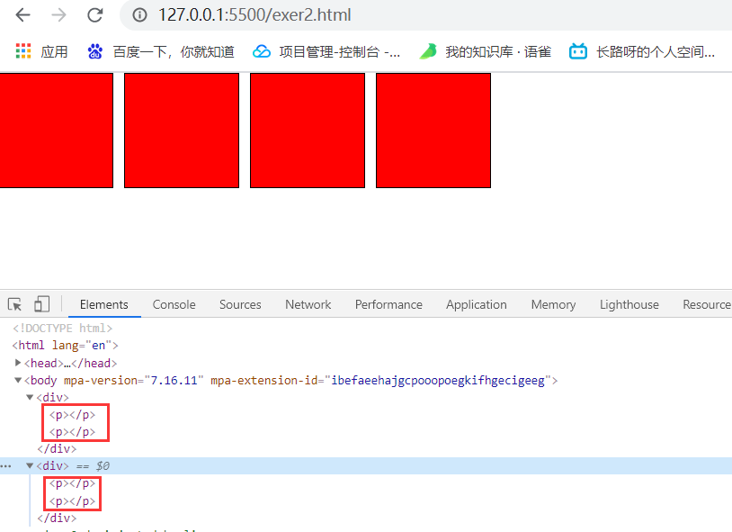
首先看下面的例子:两个div盒子中包含了对应的2个p标签,p标签都设置宽高并且设置左浮动,此时由于它们的父盒子没有设置高度,就会产生浮动到一行上的情况
<style>
    * {
        padding: 0px;
        margin: 0px;
    }

    p {
        /* 设置左浮动 */
        float: left;
        height: 100px;
        width: 100px;
        background-color: red;
        border: 1px solid #000;
        margin-right: 10px;
    }
</style>

<body>
    <div>
        <p></p>
        <p></p>
    </div>
    <div>
        <p></p>
        <p></p>
    </div>
</body>
效果展示:这个问题是由于父盒子没有形成BFC规范(也就是没有设置高度)就会导致两个div盒子中的p标签都依据body元素浮动到一行中去了。
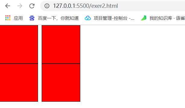
如何解决呢?最简单的一个方法就是给父盒子div都添加一个高度,这个高度应该与内部左浮动的盒子高度一致,先看一下父盒子设置高度一致的情况下有没有解决问题!
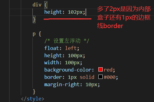
可以看到能够解决浮动问题的,这种方式给div设置margin属性也是能够生效的!
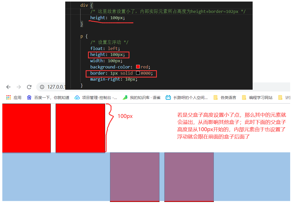
这里也要说出一个问题就是使用设置height高度的方法时,需要严格计算其中浮动的元素高度大小(可以算是一个弊端吧,需要去严格计算每个盒子的高度),若是父盒子的height高度属性稍微小了一点,就会出现下面情况:
其他四种解决方案(非div设置height)
方式一:给每个父盒子都设置overflow: hidden
原理:让内部有浮动的父盒子形成BFC,它就能够关闭住内部的浮动。
实际操作:为所有包含浮动元素的父盒子设置overflow: hidden,使其自动根据内部元素高度来进行生成高度。(支持margin属性)
div {
    overflow: hidden;
    /* margin属性生效! */
    margin-bottom: 10px;
}
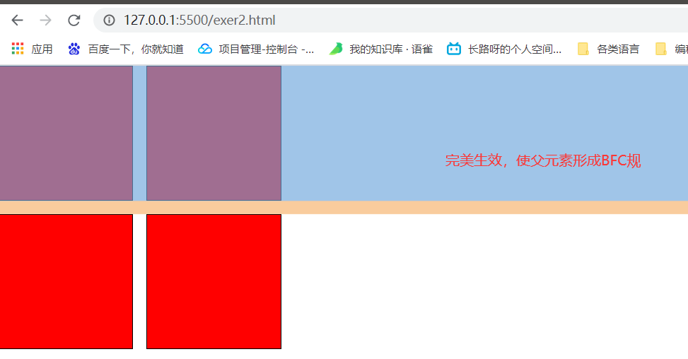
缺点:虽说使用overflow:hidden可以使其父盒子形成BFC规范,但是若是想要设置每个盒子之间的距离还需要在div元素里面去设置margin-bottom,总感觉没有那么灵活。
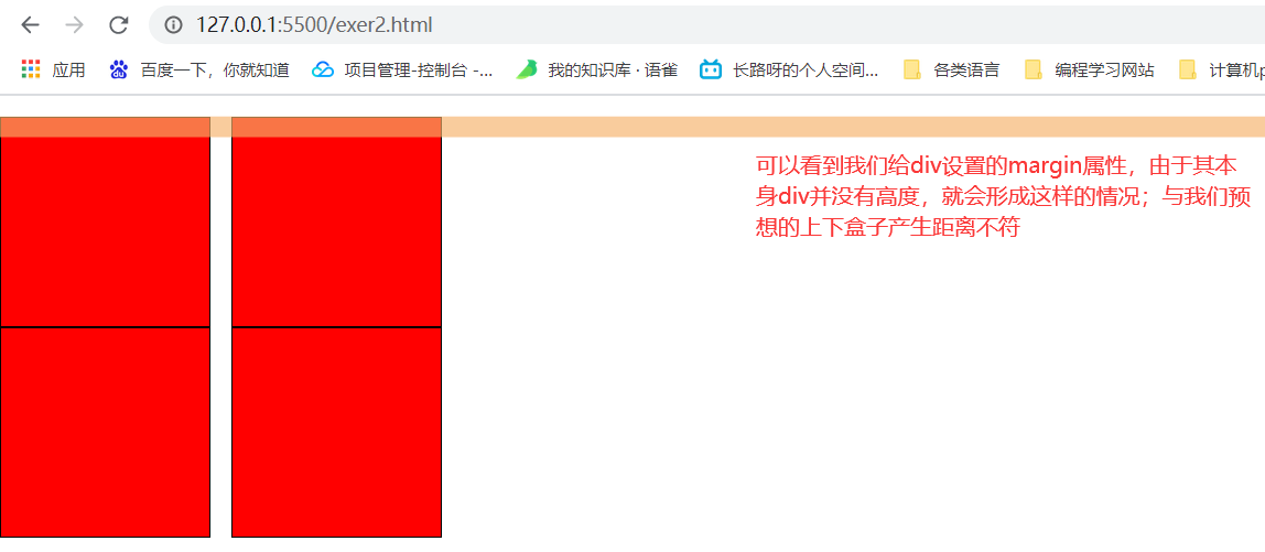
方式二:给后面的父盒子设置clear:both(margin不生效)
首先介绍一下clear属性:表示清除掉浮动对自己的影响,可以设置的值有left、right、both。
方法原理:就是在第二个div盒子里设置清除左边浮动给自己盒子带来的影响。
实际操作:给第二个盒子设置clear: left,原本是会继续根据左边的元素来进行浮动,此时设置好之后清除影响,继续从最左边开始浮动。(对div元素使用margin属性会失效!)
/* 第二个盒子设置清除左边浮动 */
.nextbox {
    clear: left;
}

div {
    /* 此时div父盒子并没有高度,实际并没有令两个盒子之间产生距离 */
    margin-bottom: 10px;
}
方法三:给每个父盒子添加::after伪元素,并设置clear:both
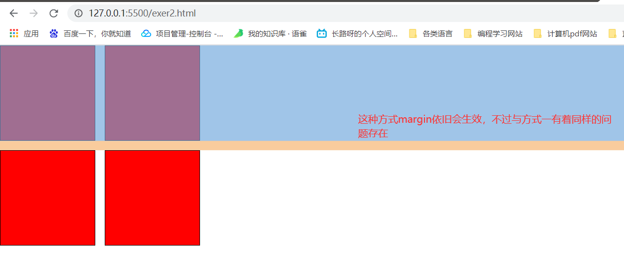
原理:通过使用::after伪元素在每个父元素盒子后添加一个块元素并且清除左右浮动,需要说明的是这个块元素可以看做是一个中间屏障。下面盒子的浮动也不会继续浮动于上面盒子的元素。
实际操作:给div元素添加::after伪元素,该伪元素content='',设置clear:both,并且将其设置为块元素,即可生效。(margin属性能够生效)
/* 每个div盒子都设置::after伪元素 */
div::after {
    /* 必须设置内容,不然无效 */
    content: '';
    /* 若是不设置清除两边浮动,下面盒子的元素会依旧左浮动到上面盒子 */
    clear: both;
    /* 必须设置为块元素,因为块元素才能够占据一行 */
    display: block;
}

div {
    /* 为div元素设置margin属性生效 */
    margin-bottom: 10px;
}
效果:
方式四:在两个盒子之间添加一个div元素并设置clear:both
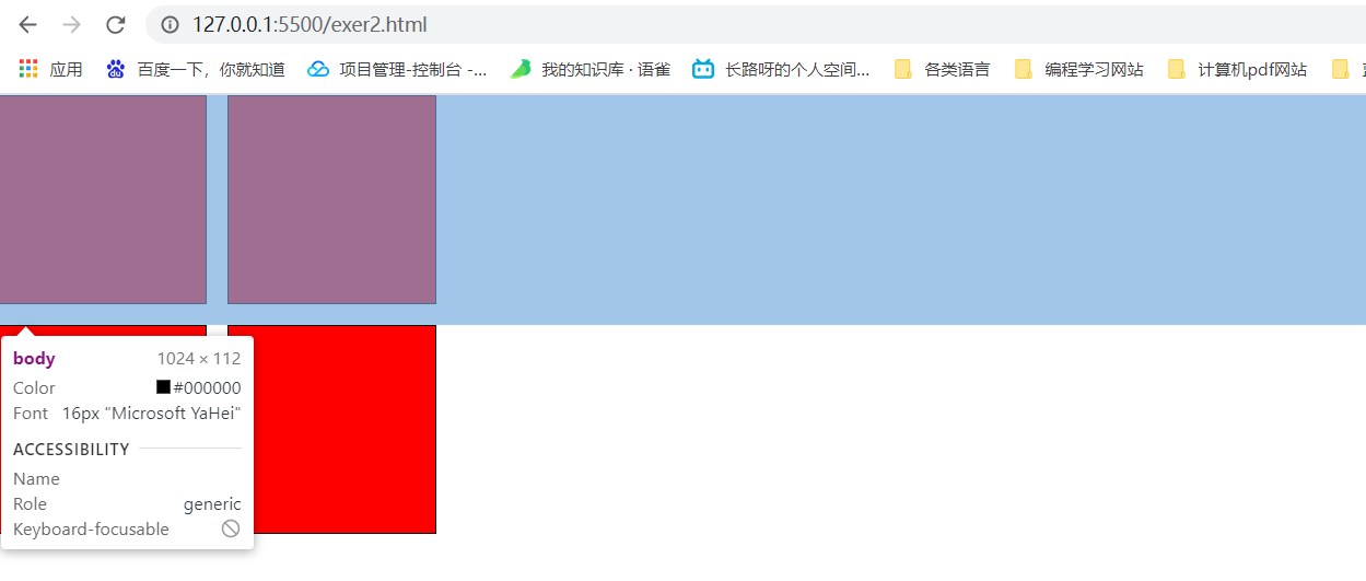
原理:在两个父盒子元素之间添加一个块元素,该块元素清除左右浮动的影响(起到了中介的作用,上面的浮动就影响不到下面的浮动),并且你可以灵活的设置高度样式类,随时可进行添加到中间的div元素中。
实际操作:在两个盒子中间添加一个div元素,该div元素样式设置clear:both来清除左右浮动。(想要设置两个盒子之间的距离,在该div元素上添加样式即可),按下面顺序设置:
<style>
    * {
        padding: 0px;
        margin: 0px;
    }

    p {
        /* 设置左浮动 */
        float: left;
        height: 100px;
        width: 100px;
        background-color: red;
        border: 1px solid #000;
        margin-right: 10px;
    }


    /* 2、为两个父盒子之间的盒子添加清除影响 */
    div.clearbox {
        /* 设置清除左右浮动影响(上盒子的浮动影响不了下盒子的) */
        clear: both;
    }

    /* 3.1、设置间隔高度 */
    .h20 {
        height: 10px;
    }

    /* 3.2、设置间隔高度 */
    .h30 {
        height: 30px;
    }
</style>

<body>
    <div>
        <p></p>
        <p></p>
    </div>
    <!-- 1、添加一个div元素,设置清除左右浮动属性以及任意指定高度 -->
    <div class="clearbox h20"></div>
    <div>
        <p></p>
        <p></p>
    </div>
</body>
二、定位
2.1、相对定位
介绍相对定位
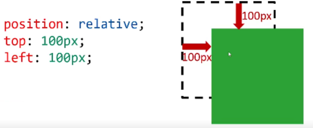
相对定位(relavtive postion):盒子可以相对自己原来的位置进行位置调整,称为相对定位。
语法:
postion: relative
top: ??
bottom: ??
具有四个位置:left、right、top、bottom;其中的值可以为负数,即往规定方向相反移动。
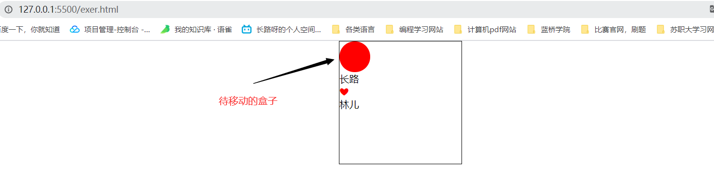
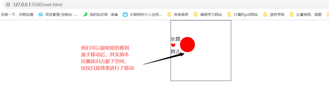
性质:相对定位的元素,会在"老家留坑",本质上仍然是在原来的位置,只不过渲染在新的地方而已,渲染的图形可以比喻成"影子",不会对页面其他元素产生任何影响。(不脱离标准流,能够进行覆盖其他的元素)
用途:①经常用下进行微调元素位置,实际上原本的位置不会改变的,只不过效果展示的会根据指定位置调节,不会影响其他元素位置。
②相对定位的盒子,可以当做是绝对定位的参考盒子。
案例1:简单展示相对定位
添加相对定位前:
添加相对定位后:
代码如下:
<style>
    * {
        padding: 0px;
        margin: 0px;
    }

    .box1 {
        height: 200px;
        width: 200px;
        border: 1px solid #000;
        margin: 0 auto;
    }

    .box2 {
        height: 50px;
        width: 50px;
        background-color: red;
        /* 设置相对定位(实际原来的位置部分不改变,效果进行改变) */
        position: relative;
        top: 55px;
        left: 30px;
        border-radius: 30px;
    }

    ul {
        list-style: none;
    }

    li:nth-child(2) {
        color: red;
    }
</style>

<body>
    <div class="box1">
        <div class="box2">
        </div>
        <ul>
            <li>长路</li>
            <li>❤</li>
            <li>林儿</li>
        </ul>
    </div>
</body>
案例2:实际应用到导航栏微调(hover效果微调)
实际效果展示
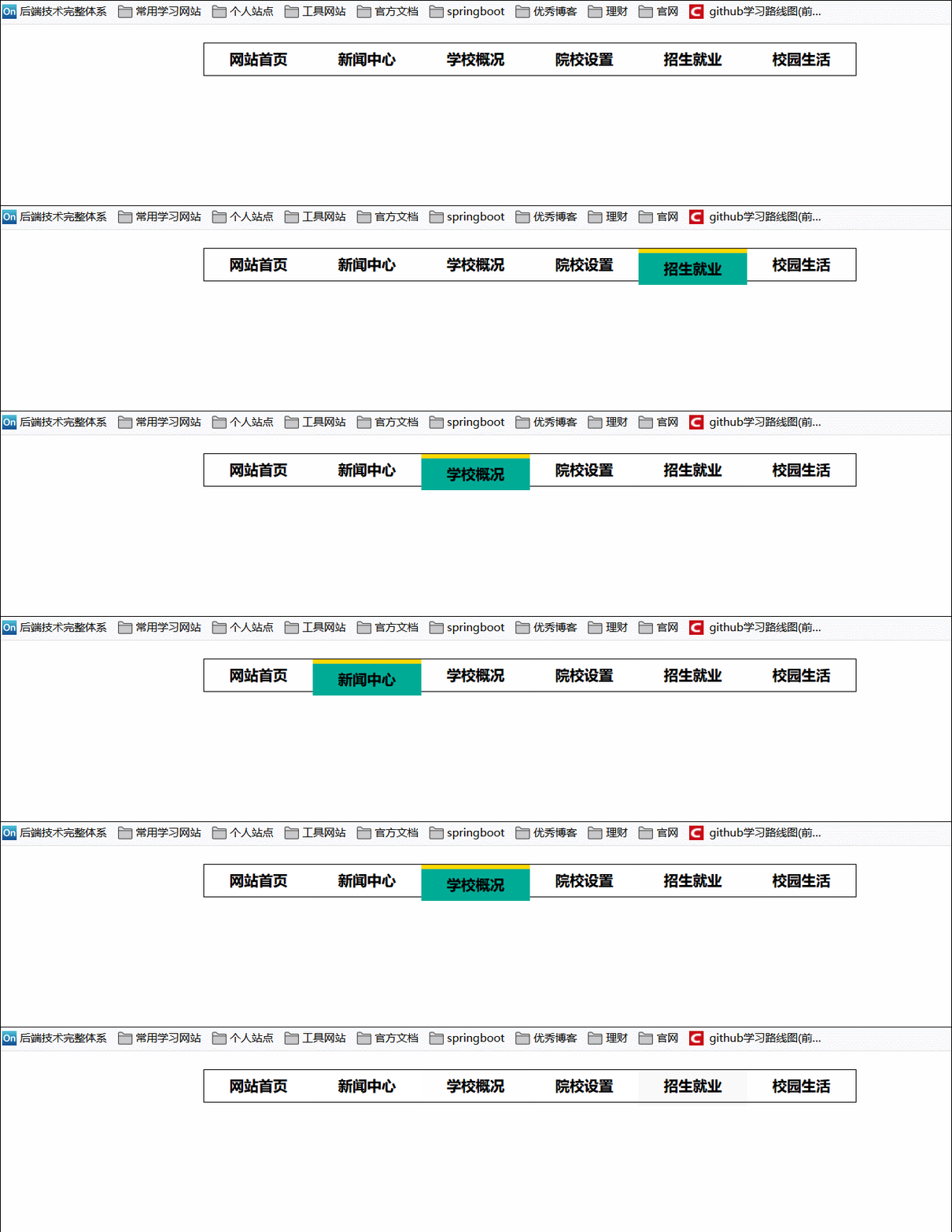
微调前效果:你可以看到每个链接触发时上边框就会触发并且将原本的内容顶到框外边去。
微调后效果:即在触发样式时将这个边框效果向上移边框高度,实际链接内容并没有被挤出去了
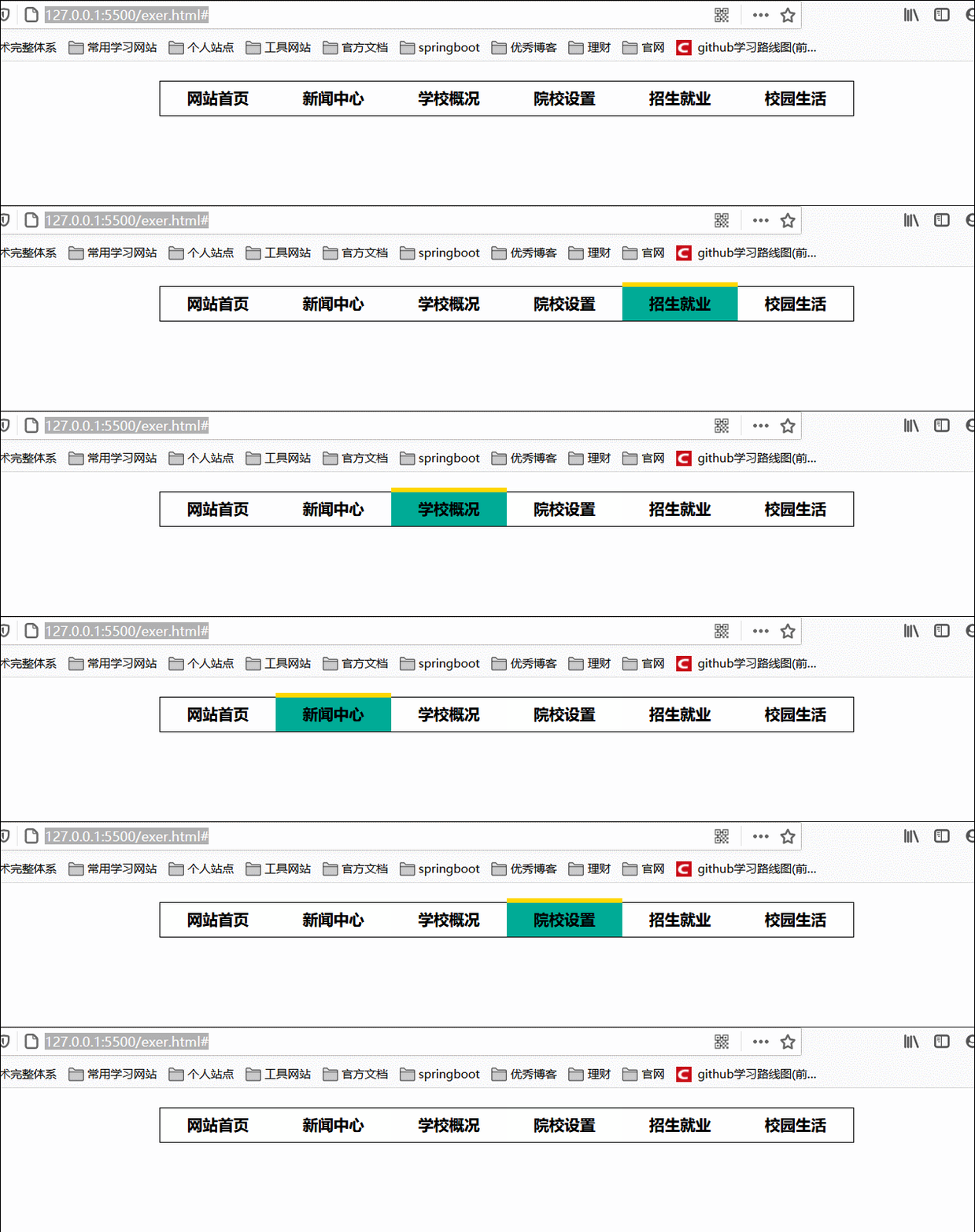
核心代码:设置hover事件的相对定位
/* 鼠标移动时触发的效果 */
div.box ul li a:hover {
    background-color: #00ac97;
    border-top: 5px solid gold;
    /* 设置相对定位为原本位置的上面5px */
    position: relative;
    top: -5px;
}
源代码
<style>
    * {
        font-weight: bold;
        color: black;
        padding: 0px;
        margin: 0px;
    }

    div {
        height: 35px;
        width: 720px;
        margin: 20px auto;
        border: 1px solid #000;
    }

    div.box ul {
        list-style-type: none;
    }

    /* 设置每个li属性 */
    div.box ul li {
        float: left;
    }

    div.box ul li a {
        text-decoration: none;
        width: 120px;
        height: 35px;
        text-align: center;
        line-height: 35px;
        /* 将a标签设置为块元素,此时才能够作用到整个宽高 */
        display: block;
    }

    /* 鼠标移动时触发的效果 */
    div.box ul li a:hover {
        background-color: #00ac97;
        border-top: 5px solid gold;
        /* 设置相对定位为原本位置的上面5px */
        position: relative;
        top: -5px;
    }
</style>

<body>
    <div class="box">
        <ul>
            <li><a href="#">网站首页</a></li>
            <li><a href="#">新闻中心</a></li>
            <li><a href="#">学校概况</a></li>
            <li><a href="#">院校设置</a></li>
            <li><a href="#">招生就业</a></li>
            <li><a href="#">校园生活</a></li>
        </ul>
    </div>
</body>
2.2、绝对定位
介绍绝对定位
绝对定位:盒子可以在浏览器中以坐标进行位置精准描述,拥有自己的绝对位置。
位置描述:left、top、right、bottom。
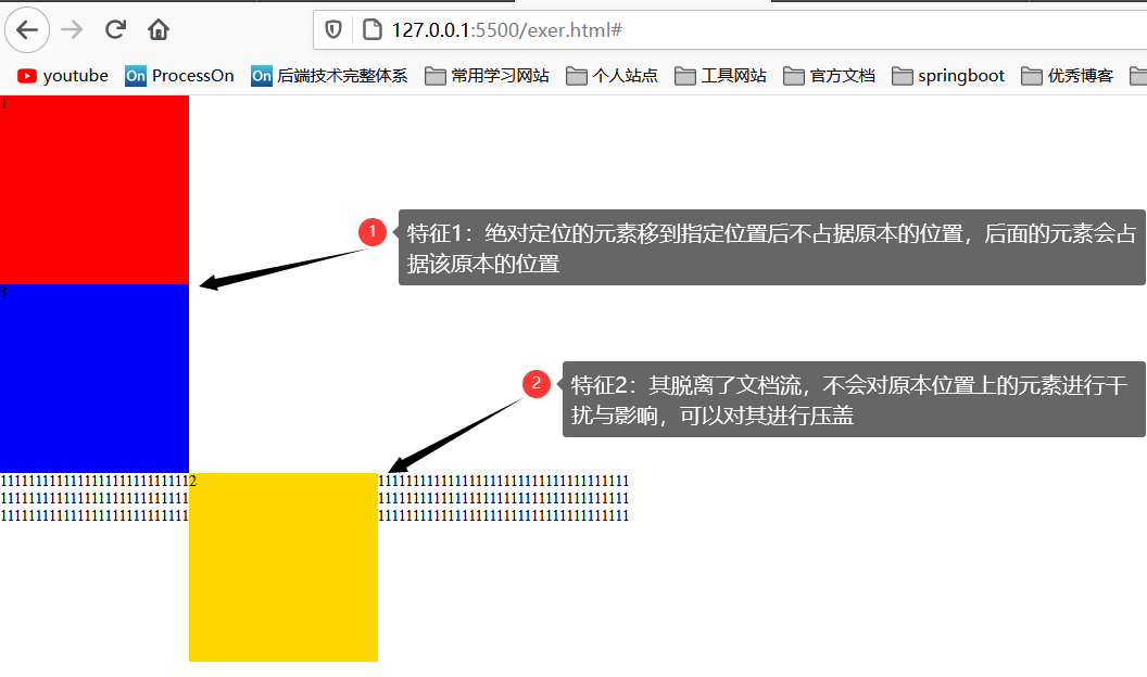
重点:绝对定位脱离标准文档流。意味它将释放自己的位置,对其他元素不会产生任何的干扰,而是对他们进行压盖。
绝对定位的参考盒子:绝对定位的盒子并不是永远以浏览器作为基准点,绝对定位的盒子会以自己祖先元素中,离自己最近的拥有定位属性的盒子当做基准点。这个盒子通常是相对定位的,所以这个性质也叫做"子绝父相"。
用途:用来制作"压盖"、"遮罩的效果",可以用来结合css精灵来使用,并且能够结合js来实现动画。
案例1:绝对定位示例
两个重点:
- 绝对定位的盒子会以自己祖先元素中,离自己最近的拥有定位属性的盒子当做基准点。(关键点是祖先节点)
- 脱离文档流,进行绝对定位之后不会对其他元素造成影响。
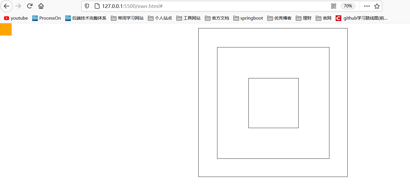
祖先节点无定位属性情况
若是祖先节点中无任何节点有定位属性,就会依据body整个页面来进行绝对定位。
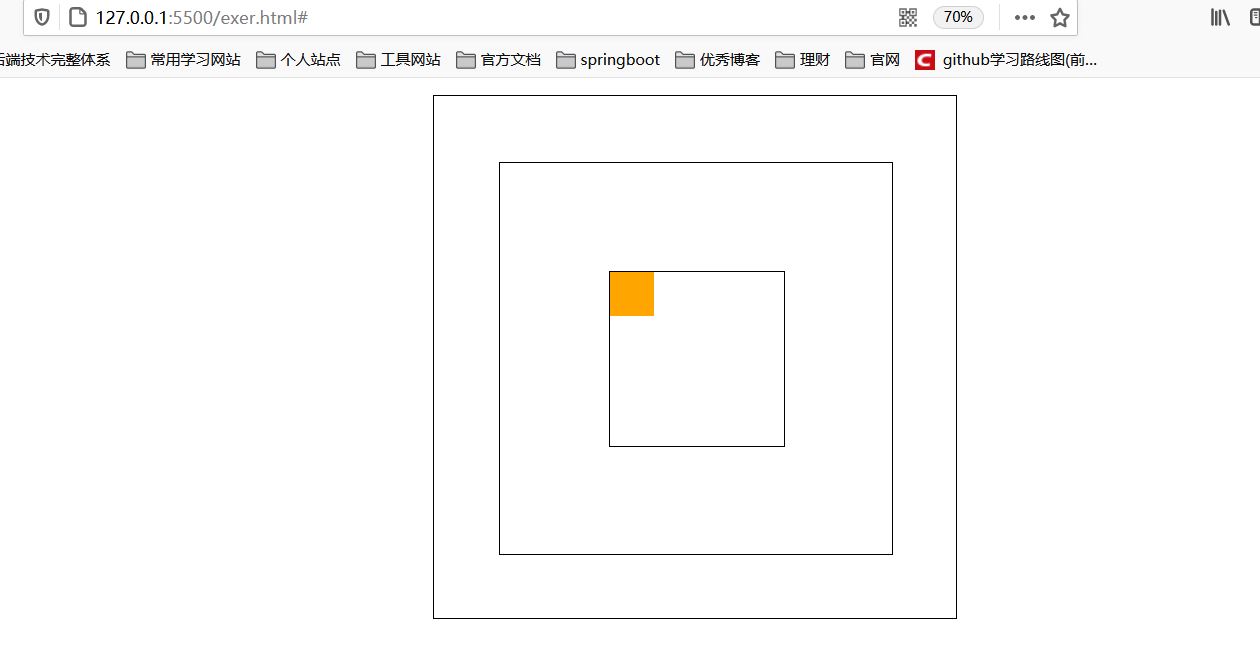
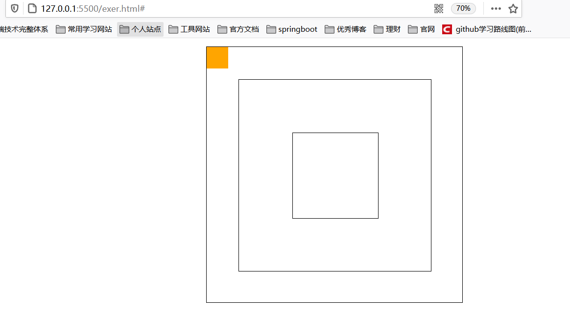
祖先节点有定位属性情况
设置绝对定位的属性永远会跟着祖先节点中的定位属性来移动位置:
源码:
<style>
    * {
        padding: 0px;
        margin: 0px;
    }

    /* 这三个祖先盒子都能够来进行设置定位属性来测试,一般定位属性设置为relative */
    div.box1 {
        width: 600px;
        height: 600px;
        border: 1px solid #000;
        margin: 20px auto;
        position: relative;
    }

    div.box2 {
        width: 450px;
        height: 450px;
        border: 1px solid #000;
        margin: 75px 75px;
    }

    div.box3 {
        width: 200px;
        height: 200px;
        border: 1px solid #000;
        margin: 125px 125px;

    }

    p {
        width: 50px;
        height: 50px;
        background-color: orange;
        /* 设置绝对定位 */
        position: absolute;
        top: 0;
        left: 0;
    }
</style>


<body>
    <div class="box1">
        <div class="box2">
            <div class="box3">
                <p></p>
            </div>
        </div>
    </div>
</body>
案例2:绝对定位实现水平垂直居中
绝对定位来达到垂直居中是一个非常使用的技术
position: absolute
top: 50%
margin-top: -自己高度的一半
说明:top50%我们知道就是占父盒子的50%高度嘛,那这个margin-top为什么是负的自己高度一半,看下面例子:
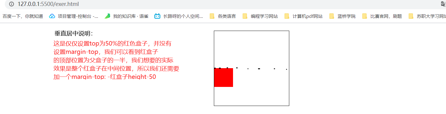
此时我们将margin-top添上:
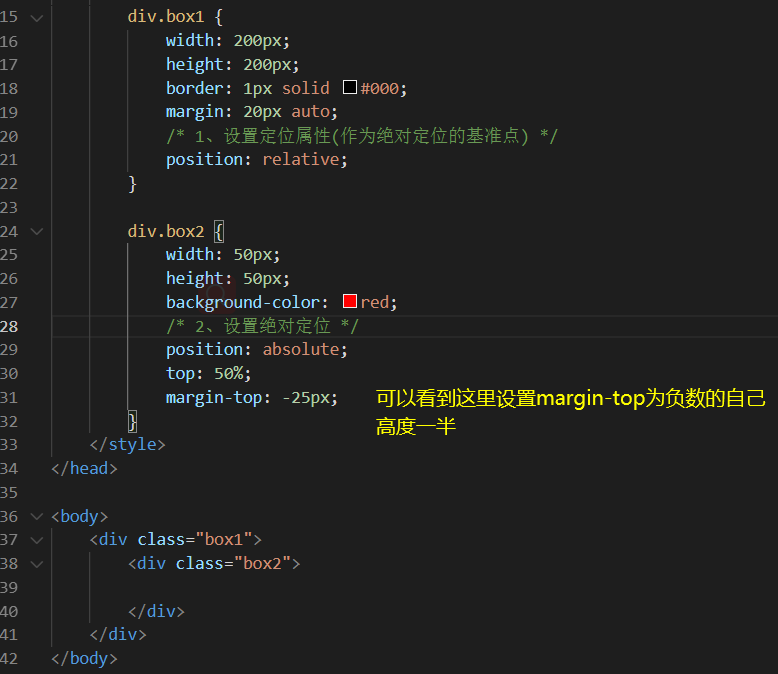
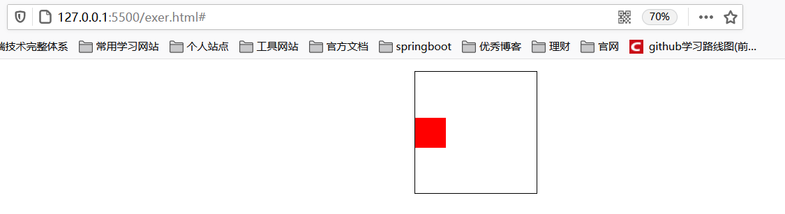
垂直居中效果:
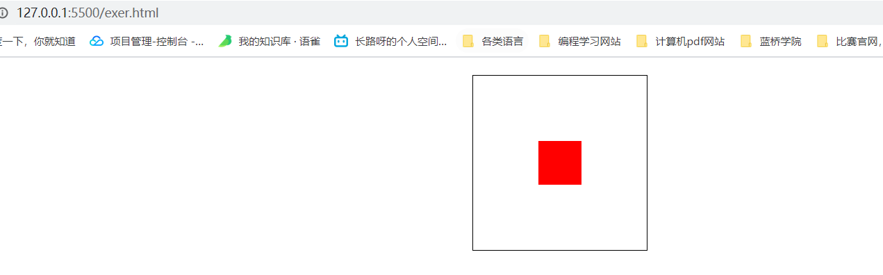
既然垂直居中做到了,那么水平居中也就很容易了一样的方法,下面给出水平垂直的核心代码:
div.box1 {
    width: 200px;
    height: 200px;
    border: 1px solid #000;
    margin: 20px auto;
    /* 1、设置定位属性(作为绝对定位的基准点) */
    position: relative;
}

div.box2 {
    width: 50px;
    height: 50px;
    background-color: red;
    /* 2、设置绝对定位 */
    position: absolute;
    /* 垂直居中 */
    top: 50%;
    margin-top: -25px;
    /* 水平居中 */
    left: 50%;
    margin-left: -25px;
}
堆叠顺序index属性
z-index属性:是一个没有单位的正整数,数值大的能够压住数值小的。
两种方式来修改堆叠顺序
①不设置z-index属性会依据写标签的顺序来进行压盖。
两个div盒子都设置绝对定位时,会脱离文档流,后写的盒子就会压盖主前面的div盒子,依照标签顺序。若是想蓝色盒子被红色盒子压盖只需要先写蓝色盒子标签后写红色盒子标签即可。
<style>
    * {
        padding: 0px;
        margin: 0px;
    }

    div.box1 {
        width: 200px;
        height: 200px;
        border: 1px solid #000;
        background-color: red;
        /* 设置绝对定位 */
        position: absolute;
        top: 150px;
        left: 150px;
    }

    div.box2 {
        width: 200px;
        height: 200px;
        border: 1px solid #000;
        background-color: blue;
        /* 设置绝对定位 */
        position: absolute;
        top: 200px;
        left: 200px;
    }
</style>

<body>
    <div class="box1"></div>
    <div class="box2"></div>
</body>
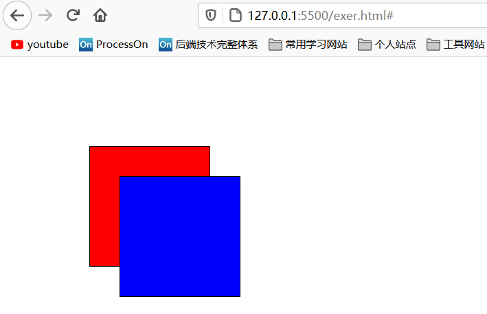
②一般来设置999或者9999,后面的大于前面的
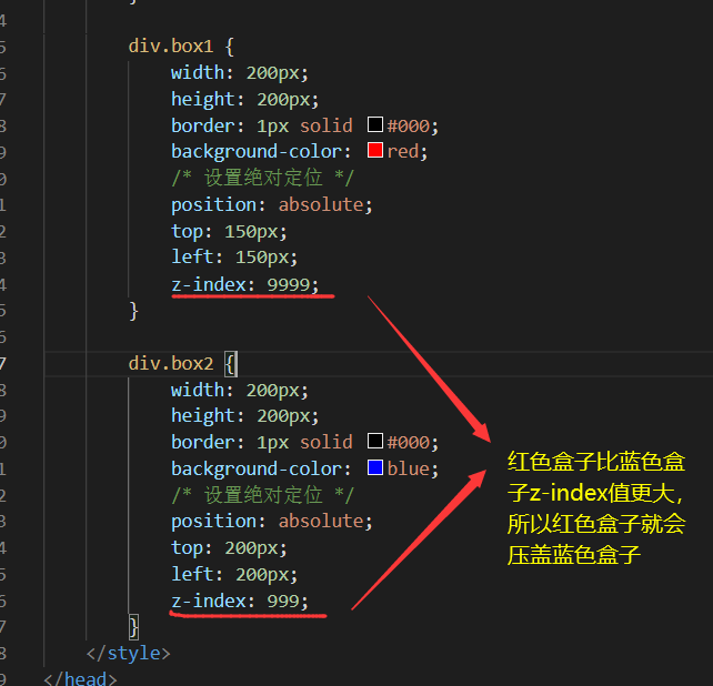
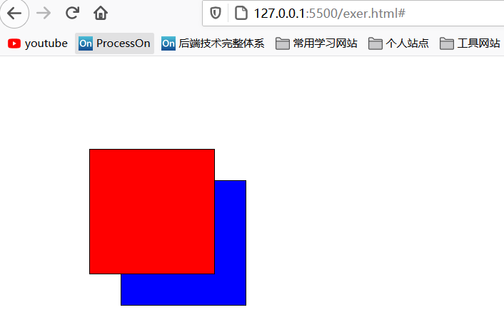
使用z-index属性即可实现压盖效果,想要实现红色盒子压盖蓝色盒子呢?在上面的设置z-index更大即可
效果:
案例3:轮播图实际案例(使用绝对定位)
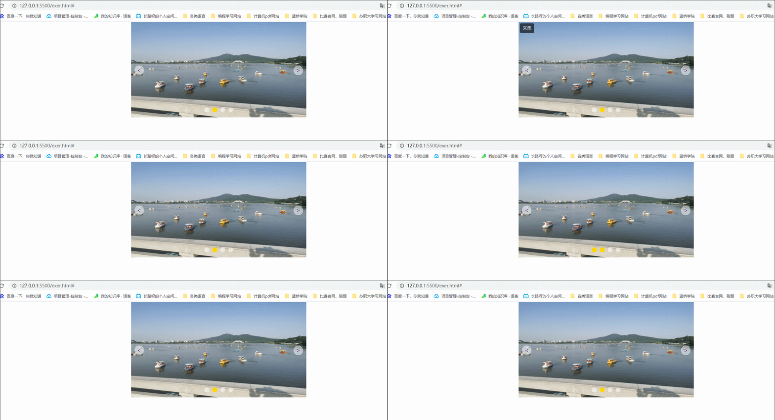
案例说明:通过使用绝对定位来实现的左右按钮的位置以及下面的小按钮组中四个小按钮的实现,并且能够触碰时有黄色效果
结构如下:
<body>
<div class="sideshow">
<img src="./123456.jpg" alt="">
<a href="#" class="rightbtn btn">></a>
<a href="#" class="leftbtn btn"><</a>
<div class="points">
<ul>
<li><a href="#"></a></li>
<li><a href="#"></a></li>
<li><a href="#"></a></li>
<li><a href="#"></a></li>
</ul>
</div>
</div>
</body>
分析:
div.sideshow:设置相对定位,来为下面的a、按钮组来作为基准点
img:展示的图片。a:使用绝对定位,相对靠左。a:使用绝对定位,相对靠右div.points:使用绝对定位,实现在图片的底部中央。
说明:对于左右按钮,在前端中实际也可以进行抽离重复的部分如btn样式,在这个样式中定义了高宽,绝对定位,背景颜色,圆框这类重复的元素,通过rightbtn,leftbtn样式可以设置绝对定位的左右位置。
小提示(tips):
- 实际开发中不建议去掉href属性,而是建议设置href="#"或者设置href="javascript:;",禁止链接刷新或跳转。
- 设置绝对定位是可以设置宽度与高度的。(可以将其看做是块元素进行设置宽高以及位置)。
css源代码:
<style>
* {
    padding: 0px;
    margin: 0px;
}

/* 外部图片居中 */
div.sideshow {
    width: 550px;
    /* 高度溢出 */
    overflow: hidden;
    margin: 0 auto;
    /* 设置相对定位:作为绝对定位的基础点 */
    position: relative;
}

/* 设置图片大小 */
img {
    width: 550px;
    height: 300px;
}

/* 去除掉超链接的下划线 */
div.sideshow a {
    text-decoration: none;
}

/* 两个按钮的css样式 */
/* 设置按钮 */
.btn {
    /* 绝对定位能够设置宽高 */
    position: absolute;
    width: 30px;
    height: 30px;
    background-color: rgb(255, 255, 255, .5);
    border-radius: 15px;
    text-align: center;
    line-height: 30px;
}

/* 左按钮 */
.leftbtn {
    left: 10px;
    /* 垂直居中 */
    top: 50%;
    margin-top: -15px;
}

/* 右按钮 */
.rightbtn {
    right: 10px;
    /* 垂直居中 */
    top: 50%;
    margin-top: -15px;
}


/* 小圆点的css样式 */
/* 小圆点按钮组 */
div.sideshow div.points {
    width: 90px;
    height: 15px;
    /* background-color: gold; */
    /* 绝对定位:设置底部20px,垂直居中 */
    position: absolute;
    bottom: 20px;
    left: 50%;
    margin-left: -45px;
    /* border: 1px solid #000; */
}

/* 去除掉ul列表的样式 */
div.sideshow div.points ul {
    list-style: none;
    text-align: center;
}

/* 设置li的属性 */
div.sideshow div.points ul li a {
    /* 左悬浮 */
    float: left;
    width: 15px;
    height: 15px;
    border-radius: 12.5px;
    background-color: rgb(255, 255, 255, .5);
    line-height: 25px;
    margin-right: 10px;
}

/* 最后一个小圆点的右外边距为0px */
div.sideshow div.points ul li:nth-child(4) a {
    margin-right: 0px;
}

/* 设置小圆点触碰时为黄色 */
div.sideshow div.points ul li a:hover {
    background-color: gold;
}

/* 默认第2个小圆点是黄色 */
div.sideshow div.points ul li:nth-child(2) a {
    background-color: gold;
}
</style>
2.3、固定定位
介绍
含义:不管页面如何卷动,它永远固定在那里。永远以浏览器为参考固定在那里。
语法:postion:fixed
注意点:固定定位只能以页面为参考点,没有子固父相这个性质,固定定位脱离标准文档流。
用途:返回顶部,楼层导航。
示例
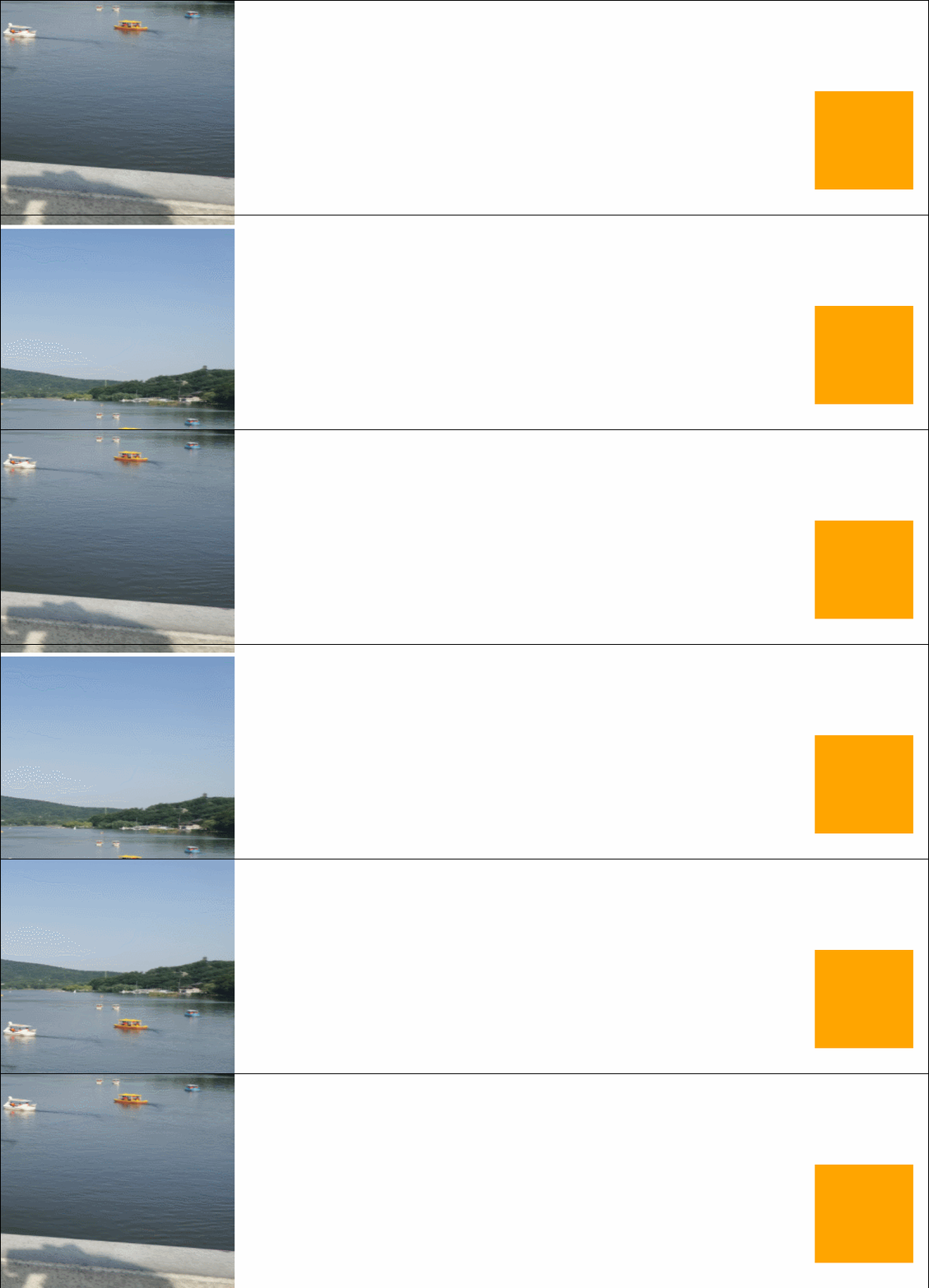
可以看到无论你屏幕如何滚动,右下角的盒子都不会移动,一直固定着。
源码:
<style>
    * {
        padding: 0px;
        margin: 0px;
    }

    img {
        width: 800px;
        height: 400px;
    }

    /* 盒子进行固定定位 */
    .box {
        height: 100px;
        width: 100px;
        position: fixed;
        bottom: 30px;
        right: 30px;
        background-color: orange;
    }
</style>

<body>
    <img src="./123456.jpg" alt="">
    <img src="./123456.jpg" alt="">
    <img src="./123456.jpg" alt="">
    <img src="./123456.jpg" alt="">
    <img src="./123456.jpg" alt="">
    <img src="./123456.jpg" alt="">
    <img src="./123456.jpg" alt="">
    <img src="./123456.jpg" alt="">
    <img src="./123456.jpg" alt="">
    <div class="box">
    </div>
</body>
脱离文档流的三种方法
脱离文档流概念:意味它将释放自己的位置,对其他元素不会产生任何的干扰,而是对他们进行压盖。
浮动、绝对定位与固定定位
整理者:长路 时间:2021.6.1
评论区请在客户端页面查看